
So given the nice, pretty charts in Part 1 and Part 2, what conclusions can we draw about the Chesapeake Bay dockominium market? Lets combine the data and pick out the patterns.
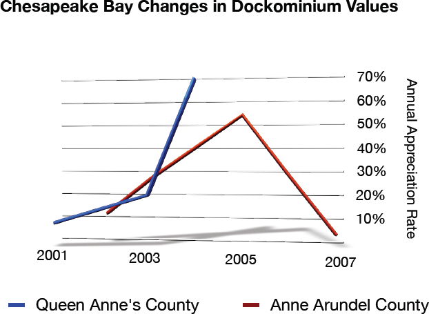
Surprisingly, it appears that Queen Anne’s County was a hotter market… perhaps because there is only one major dockominium project and maybe they they had it all to themselves. Still, the downturn in the market is drastic and quite evident.
Let’s also pair the number of paired sales.
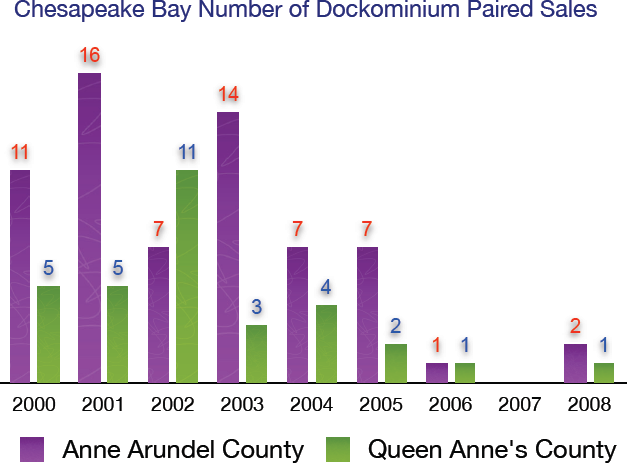
Anne Arundel County generally had many more paired sales but that’s to be expected given that it has about three times the number of dockominiums than Queen Anne’s County. What is really interesting is the drop-off in 2006, 2007 and 2008. Basically, dockominium sales activity came to a virtual standstill. Think about the changes that happened in demand for the residential market. Didn’t the problem start in 2006?
Next time you hear our government “officially” declaring December 2008 as the start of the recession, you’ve got proof that the spin is in.